One of the most requested and longest awaited features is finally here:
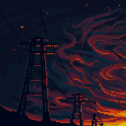
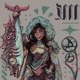
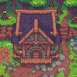
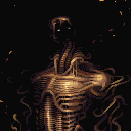
You can now link to the palette you used on an art piece.
Yes you could manually do it with a text link in the description before, but this goes much deeper.
When you submit a gallery piece now, the submission form will automatically scan it's colors and match it against all palettes on Lospec. If any matches are found, it will show them to you, and you can link it with a single click. The palette will then show under the "specs" list on the gallery page, with a link back to the palette.
If your colors didn't match any palettes exactly, but found some with very similar colors, it will list those too, in case you just did an oopsie and skronkled them up slightly. It will then let you force the colors to conform the palette so they match the hex codes exactly. This ensures any piece that links to a palette uses it exactly. When you do this conversion there will be a popup showing you the before and after so you can ensure the result looks as it should.
This system does not apply to all categories, for example the "Enhanced Pixel Art" or "Voxel Render" categories, where you may have used a palette, but the resulting image contains more colors. For these you can simply search for the palette you used and select it. The specs section will then put a little dippalidoo saying the palette is unrestricted, meaning it's not exactly the same colors in the image, and it was chosen by the artist.
I attempted to auto-match existing gallery pieces to palettes so it wouldn't only be new pieces utilizing this feature. About 20% of the existing 17k gallery pieces were given a palette. Some of these may be wrong, and some pieces might have been missed, but this is a good start. Pieces that require conversion to match the palette were not touched, as that's a decision that should be made by the artist, not me.
If your old piece was missed or mismatched, you can easily link a palette by editing the submission. Palettes will be automatically shown under the palette section just like with new submissions, and you can link/convert them the same way.
Unsurprisingly, the most commonly used palettes were apollo, dawnbringer-32, pico-8, resurrect-64, aap-64, slso8, endesga-64, lost-century, endesga-32, and oil-6.
This feature utilizes another feature released in a recent update, the Palette Identifier to match palettes. This was a big update with a lot of moving parts so I broke it into a few pieces. And there are more to come.
Now that palettes can be directly linked to palettes, we'll be able to see a collection of art pieces that each palette was used for. This will be utilized by the long awaited Palette List v2 update. Aside from just searching for the most utilized palettes, this will also allow us to begin automatically creating palette example blocks from gallery images, and can eventually retire the submission of 464x120 palette example images, which has angered many and resulted in several extremist antilospecular cults.
So get out there and start submitting some beautiful palette-linked art!























































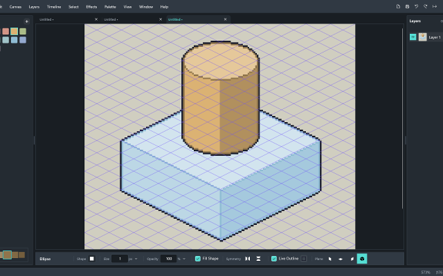
 Rastrivo Studio

 ArcBrush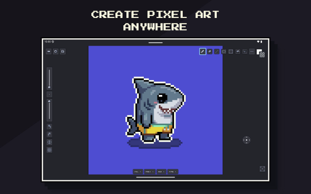
 Pixsama: Pixel Art Editor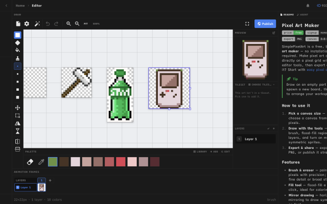
 Simple Pixel Art Editor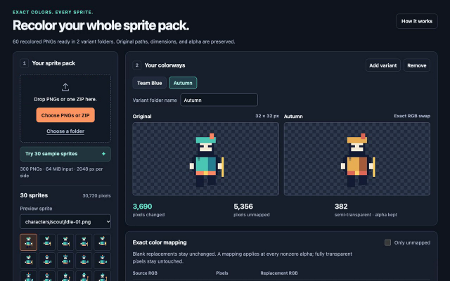
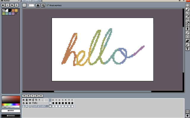
 Xprite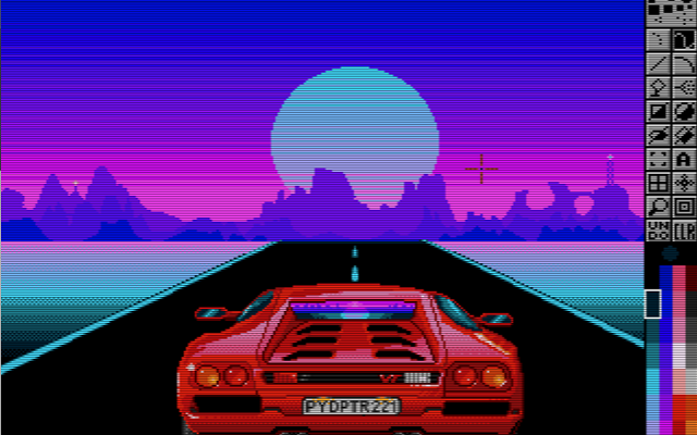
 PyDPainter
 Baipix

 Inktica
 spritebit
 and your work stays on your device. Prefer a real program? The Windows desktop app has the same features, opens the same project files and handles canvases up to 8192 × 8192.
Thanks for your feedback! If you want to say more, please post a Suggestion or Bug Report!
our next patreon goal: $263 / $500