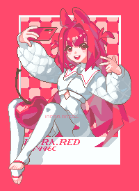
it's me!

AD| join Patreon to remove ads!
Specs
Comments (5)
Lospec Gallery Sponsors
The people below made helped bring the Lospec Gallery to life with a generous donation to our Kickstarter! Without them this would not have been possible!


AD| join Patreon to remove ads!
| SESSIONS | USERS | PAGEVIEWS |
|---|

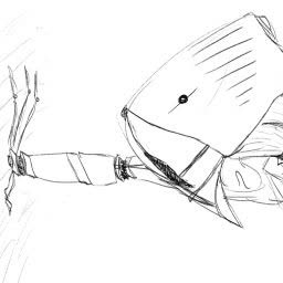
I don't think I understood you about the tangents, would you mind explaining it further?
I'll try it out! I've heard of GrafX2 before, but I haven't had any experience with it since I primarily use Aseprite.
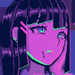
I'm really hoping I can explain it with out pictures. My best example would be her left hand cuff. The part of the cuff that intersects with the sleeve could have been moved one pixel over instead of slightly shifting colors to prevent having a brown blob. I hope what I'm saying makes some sort of sense? I really hope I'm using the right terms (lol).
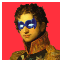
The quilting on the jacket is especially well executed
I would say "great palette" too, but with a colorcount of 41 I just can't. Most of the colors can be told apart by the naked eye, but some can't, or at least not enough to warrant being separate - indices #2 and #4; #5, #6 and maybe #8; #20 and #21, #27 and #28. I haven't looked at this long enough to figure out if those colors appear next to one another to create a subtle contrast, but if they don't, the palette could be optimized down to 32 or slightly above that.
Thank you for the critique!!
I agree that the palette is a inflated and can be cute down. Optimizing colors has been my biggest weakness so far. At the end of the piece I try to go back and cut down on the amount of colors. I went from 60(ish) > 41 on this piece?
You are right though! Some of these are right next to each other for a subtle contrast. Looking back on it I might be using the slight hue shift as a crutch whenever there is a tangent. Hopefully, with experience and better planning it won't become a habit.