Artificial Angel
AD| join Patreon to remove ads!
Specs
Comments (4)
Lospec Gallery Sponsors
The people below made helped bring the Lospec Gallery to life with a generous donation to our Kickstarter! Without them this would not have been possible!
AD| join Patreon to remove ads!
| SESSIONS | USERS | PAGEVIEWS |
|---|











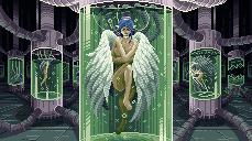
So, while the piece has used available colors well, her eyebrows have quite dark value in comparison to rest of the character's face. This makes it look like her eyebrows are part of her eye sockets, but this can be easily fixed by using a lighter color for the eyebrows. The main reason why the eyes become hard to read is that the eye and eyebrow have too similar value and thus look like one cluster. It's good to verify the piece is redible even at 1:1 size as in pixel art many smaller details can accidentally become unreadable by just changing a single pixel a bit.
I think you might want to study a bit more anatomy as the angel's lower torso is elongated quite a lot in a sneaky manner and her front ankle looks a bit twisted. You can verify a character's pose by mimicing it. So, in this case by lifting your own leg up like she is doing, you will notice that your knee will be at chest height while in the piece it barely passes her navel.
Back to the good stuff: Glass and the shiny reflections are very well done. The background elements read well as they are darker in value than the foreground elements.
Overall a great job! I hope you keep on making pixel art as it is a ton of fun to learn and you are already making really involved pieces.