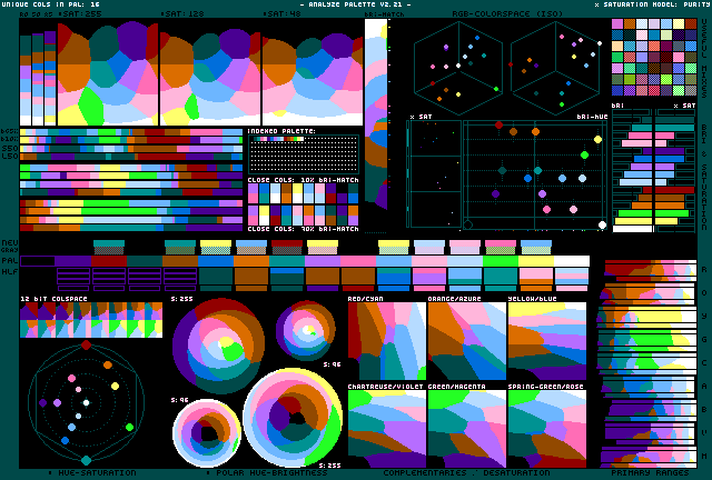
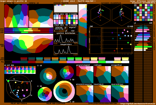
Krzywinski Colorblind 16 Palette
A color palette for color blindness developed by Martin KrzywinskiMartin Krzywinski. This palette is designed so that colors can be distinguished by individuals with deutranopia and protanopia. Some colors may appear similar to individuals with tritanopia. The original palette has 15 colors, since it assumes a white field. White has been added as a sixteenth color.#krzywinskicolorblind16 on BSKY MSTDN INSTA X
Likes:
Number of colors: 16
Downloads: 320
#000000
#004949
#009292
#ff6db6
#ffb6db
#490092
#006edb
#b66dff
#6db6ff
#b6dbff
#920000
#924900
#db6d00
#24ff24
#ffff6d
#ffffff
Downloads
How to import palettesMore Palettes
Back to the Palette List Random PaletteExamples
This palette has no examples yet.
Comments (1)


