I see a lot of cool-color palettes which go from a darker blue-purple to a lighter blue-green, so I decided, "why not reverse that?" Since everyone's doing their Mermay drawings, May seemed like the perfect time to post it.
- #weirdoceanpalette
- 6 colors
- 414 downloads
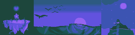
Panel 1: A recolor of the Flowey image from my Undertale-themed palette example. Panel 2: An eerie ocean sunset. Panel 3: A mermaid sitting on a rock in glowing water, looking at a seashell. - by
StellarBee
Tags: green, blue, purple, ocean, sea, cool, cold, magic, mermaid, night
Palette taken from a dream I had where I was scrolling through tumblr and all the art that I could see was drawn in this palette. Pastel pink for the background color, magenta/hot pink for the lineart, and pastel blue and pastel yellow for the occasional shadows and highlights respectively. When I woke up I decided to recreate it in real life, since the palette seems like it still holds up.
- #blogofdreams4palette
- 4 colors
- 148 downloads
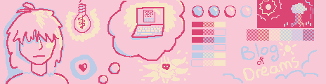
On the left side of the image: Kris from Deltarune staring at a lightbulb; the red Soul from Deltarune. In the middle: A thought bubble containing a laptop; a small doodle of the Radiance from Hollow Knight. On the right: A demonstration of how the colors can be mixed and used for shading; the title of the palette. - by
StellarBee
Tags: pastel, primary, primarycolors, magenta, pink, simple, 2bit, cute, dream, dreams
Based on the North Queensland Day Moth, this palette has two darker colors and two lighter colors, and is designed with heavy use of dithering or mixing colors in mind. It could also be used for a simpler gameboy style with less dithering, as the colors do form a ramp. It's just that wouldn't be as easy to look at, because the colors aren't evenly spaced.
- #daymothdithering
- 4 colors
- 334 downloads
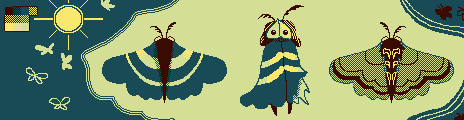
Featuring: Examples of colors achieved through dithering; several small moths; a close-up of a North Queensland Day Moth (front and back), and a humanoid character inspired by a moth. - by
StellarBee
Tags: 2bit, green, brown, dithering, gameboy, gb, insects, bugs, butterfly, moth
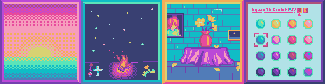
Two ramps. Five shared colors. Seven souls? Inspired by both the darkness and vibrance of Toby Fox's Underground, these classic pixely colors are perfect for some classic pixely art. Both the warm ramp and cool ramp are bookended with black, gray and purple on one end, and gold and white on the other. I picked magenta and scarlet rather than red and orange to allow for a greater variety in reds and purples, and because orange really isn't that prevalent in Undertale. (The latest in my series of palettes inspired by games that I like.)
- #utunderneath
- 9 colors
- 406 downloads
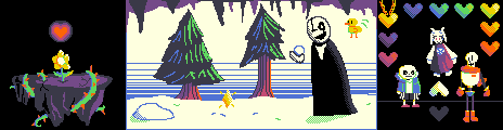
3 scenes featuring characters from Toby Fox's "Undertale": Flowey sitting ominously on a floating island with the player's Soul floating above him; Mysteryman (theorized to be Gaster) and a small yellow bird playing in the snow; Sans, Toriel, and Papyrus on a black background along with many colorful hearts, including a heart locket. - by
StellarBee
Tags: undertale, videogame, fandom, cave, rainbow, retro, bright
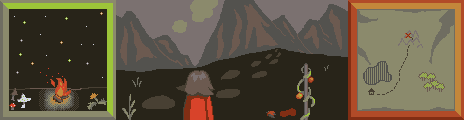
A dubious, moldy yellow monochrome inspired by Level 0 of the Backrooms horror setting with its yellow walls, lighting, and carpet.
- #liminallemon
- 5 colors
- 576 downloads
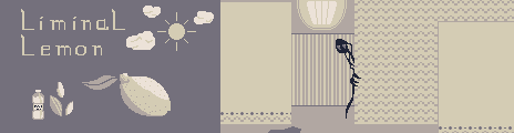
On the left: A bottle of almond water with some slivered almonds, a nostalgic blue sky, and a faded picture of a lemon. On the right: a surprisingly cautious entity peeks around a wall in Backrooms Level 0. - by
StellarBee
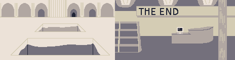
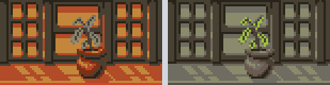
A couple more famous Backrooms levels, commonly known as the Poolrooms and the End/the library level. - by
StellarBee
Tags: yellow, grayscale, gray, grey, greyscale, monochrome, liminal, horror, fandom
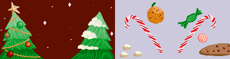
Just in time for Christmas! Inspired by the rejected palette "Gingerbread sadness" (https://lospec.com/palette-list/gingerbread-sadness-rejected-0uK1), this cheerful palette brings greater range to the original palette's seasonal tones using colors sampled from real decorated gingerbread cookies. It can be used to make a number of classic treats, including snowball cookies, clove oranges, and candy canes. In addition, its warm tones are great for cozy indoor scenes, and the greens work well for pine trees.
- #gingerbreadjoypalette
- 24 colors
- 238 downloads
Colors used on the sprite of Marmu, a cheerful, ghostly caterpillar in the game "Hollow Knight" by Team Cherry (The sprite can be found here: https://hollowknight.wiki/w/Marmu). The palette itself looks crisp and leafy- the sort of palette a caterpillar might enjoy, in fact. The dark blue-black and the light yellow can act as beginning and ending points for both the red-brown ramp and the green ramp. It works for spring, fall, and summer scenes, and perhaps even for cozy indoor winter scenes with sweaters and hot cocoa.
- #marmupalette
- 7 colors
- 203 downloads
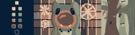
Scene 1: Example of the shading combinations in this palette. Scene 2: The character Marmu from "Hollow Knight" by Team Cherry, over a dithered plaid background. Scene 3: A variety of pixel insects climbing on trees. - by
StellarBee
Tags: fandom, hollowknight, warm, green, spring, fall, summer, bugs, insects, videogame
Colors picked from a photo of an iridescent puddle of oil. Ironically, it turned out to be great for drawing fish and sea life, as they often have the same shimmery quality.
- #poisonrainbow
- 12 colors
- 309 downloads
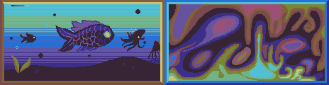
Image 1: A shimmery black fish with startlingly bright eyes swims through the ocean, accompanied by other silhouettes of sea creatures. Image 2: A lava-lamp-like drawing of a rainbow patch of oil, like the one the palette was based on. - by
StellarBee
Tags: oil, rainbow, abstract, dark, poison, sea, fish
In this palette, I reflected on what I've learned about pixel art in the past months, and reworked my first (and honestly pretty bad) palette, DR- Darkworld Neon. I mixed new colors for each of those represented in the old palette, resulting in a new palette that's bright but not eyeball-scorching and actually works well together. As shown in the example, pretty much any of the lighter colors can be used as highlights for any of the darker colors, allowing you to change the warmth of the lighting.
- #neonreflection
- 12 colors
- 655 downloads
Scenes 1 and 2 were taken from other palette samples I've done and painstakingly recolored to showcase the beauty of this palette. Scene 3 is a part of a larger project I am working on but have not yet submitted here. Scene 4 shows a color/theme select screen for a hypothetical video game. - by
StellarBee
Tags: fandom, deltarune, vaporwave, galaxy, blue, magenta, bright, videogame
A palette made from colors taken from photos of tomatos and pewter dishes, a notoriously poisonous combination. Like its namesake, these colors might seem dangerous to combine. But the gloomy metallic tones and vibrant, acidic highlights can create something startling and beautiful. Just... don't try to eat it. Please.
- #tomatoandpewter
- 13 colors
- 363 downloads
If it's alright, just ignore the previous one and look at this one. I fixed the window frames/picture frames around the secondary scenes so that they're more clearly shaded. - by
StellarBee
Example by
tjeeper
Tags: metal, blood, poison, tomato, moss, toxic, stone, dark, grim, volcano
There are no more palettes for your current selection.

Thanks for your feedback! If you want to say more, please post a Suggestion or Bug Report!
our next patreon goal: $283 / $500