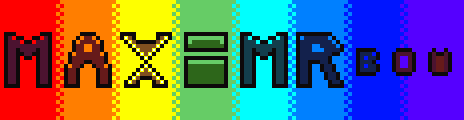
MaxiM RBow Palette
One of the first palettes i genuinely made and thought of that came out of my brain.Likes:
Number of colors: 16
Downloads: 3
#f2fffc
#feff00
#ff7e00
#ff0000
#661a1a
#805020
#4c1330
#1a0826
#5f5380
#0015ff
#0080ff
#16d9c8
#66cc66
#2d661a
#133e4c
#13214c
Downloads
How to import palettesMore Palettes
Back to the Palette List Random PaletteExamples
Pending Examples
-
 pending
Example by Chicknhawk
-
 pending
Example by Chicknhawk
This palette has no examples yet.

Second idea: There is a higher contrast between 0d090a and the palette's next darkest colors when compared to the contrast between the lighter colors. I think this could be changed by rebalancing all the ramps or making the color more of an off-black, like an even darker purple for example.
Side note: One thing I saw from your YT channel and palette example submissions is that you tend to draw in smaller scales and use very gradual dithering to acheive gentle gradients between two colors. I recommend that if you do happen to make any adjustments, it would be beneficial to test your palette by making multiple drawings in larger sizes while relying less on dithering. This should give you valuable insight on the colors of the palette, like if certain colors fit well as highlights or shadows for other colors. If you find out that isn't the case, adjust the colors themselves instead of adding more.
This is where my ability to give insights ends unfortunately, as I have never made a palette consiting of more than one color ramp. If you need more, join the Lospec Discord.