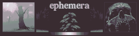
EPHEMERA
Created by K C
A 12 color palette with a wistful feel. A reminiscent pink that fades into a foggy earth green. Enough colors for shading. Perfect for foggy landscapes or surreal scenery.
Likes:
- #ephemerapalette
- 12 colors
- 8,929 downloads
Warning: a modern web browser is required to use this website.
We detected that you may have an out of date or unsupported web browser. This tool, like many others on this site and across the web uses features only available in new web browsers. We reccommend updating your current browser or downloading Firefox or Chrome.
The Lospec Palette List is a database of palettes for pixel art. We include both palettes that originate from old hardware that could only display a few colors, as well as palettes created by pixel artists specifically for making art.
Usage Guide | Random Palette | Rejected Palettes | Your Likes | NEW October Palette Contest | September
Created by K C
A 12 color palette with a wistful feel. A reminiscent pink that fades into a foggy earth green. Enough colors for shading. Perfect for foggy landscapes or surreal scenery.
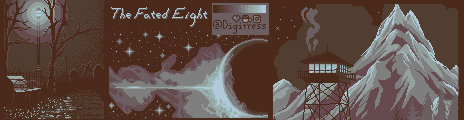
Created by Digi
An eight color palette with cold highlights and warm lowlights. The desaturated light hues shift gradually towards murky warm browns, with more prominent shifting the further toward each extreme, making it perfect for creating moody, foggy scenes. Don't be fooled by the color relativity - there's more green in the highlights than you'd expect. The Fibonacci sequence helped me choose the various amount of shifts in hue and luminescence throughout this palette, each being adjusted further for readability and contrast.
Created by SteelSoldier
A dark blue that transitions into a creamy yelloweish colour
Created by DaSunfish
This is my first palette! It's a lowly saturated palette with greens and blues, designed for murky or darker pixel art.
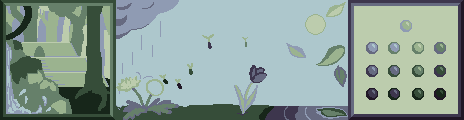
First image: An old temple in the jungle, half hidden by a small waterfall. Made specifically for this sample. Second image: Meant to show the changing of seasons. Made for another palette I never ended up submitting; repurposed, edited and recolored for this one. Third image: shows the four shading styles which can be used due to the greens being slightly lighter than the blues: the crisp blue-on-blue and green-on-green, the softer blue-on-green, and the darker green-on-blue. - by StellarBee
Tags: green, blue, dark, unsaturated, pastel, water, murky, fog, 10
AD| join Patreon to remove ads!
| SESSIONS | USERS | PAGEVIEWS |
|---|
Popup Message
Choose one of the services below to link to your Lospec Account:
Already have an account? Login now
Lospec can now be installed as an app with supported web browsers.

Installing Lospec as an app gives you a desktop shortcut and a new streamlined menu interface.
Just click install to instantly add the Lospec app to your desktop!
Your current web browser isn't supported. To install the app, open Lospec.com/app in Google Chrome

Thanks for your feedback! If you want to say more, please post a Suggestion or Bug Report!
our next patreon goal: $283 / $500