Inspired by the playful colors and designs of the late 90s and vaporwave asthetics, this hyper saturated palette is perfect for abstract pieces, fonts, and UI designs thanks to the high contrast and attention grabbing harmonies. Don't be fooled by the unconventional shifts though - it can yield surprisingly pleasing space scenes, skies, and even full landscapes! Deep indigo shifts through playful purples before skyrocketing to warmer magenta and orange, then veers crazily into green before finally landing on a crisp off white highlight.
- #vaporcraze
- 8 colors
- 769 downloads
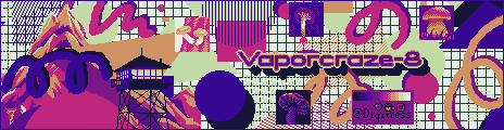
A fun, busy art piece showcasing various uses of the palette vaporcraze-8 featuring abstract design elements lending to the asthetic which inspired the palette and including samples of the palette used in various of my previous artworks - by
Digi
Tags: vaporwave, ui, design, nostalgia, space
An eight color palette with cold highlights and warm lowlights. The desaturated light hues shift gradually towards murky warm browns, with more prominent shifting the further toward each extreme, making it perfect for creating moody, foggy scenes. Don't be fooled by the color relativity - there's more green in the highlights than you'd expect. The Fibonacci sequence helped me choose the various amount of shifts in hue and luminescence throughout this palette, each being adjusted further for readability and contrast.
- #fatedeight
- 8 colors
- 786 downloads
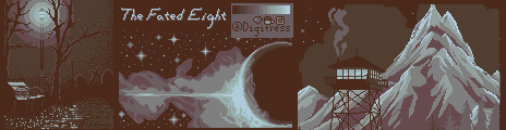
An image showing the various uses for the palette "The Fated Eight". Examples inclue other artworks of mine which have been adjusted and recolored using the palette. - by
Digi
Tags: cold, fog, brown, teal, moody, brown, hueshift, fibonacci
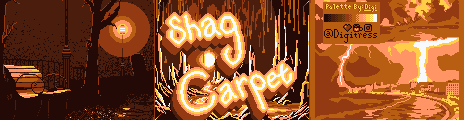
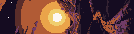
Eight warm hues ranging from deep, rich browns to orangey-pink, all the way to yellow with a pop of a surprisingly cool off white for extra contrast. Lose yourself in an ocean of shag carpet, wood paneling, and the groovy warm hues of the late 70s and 80s. Inspired by some original carpet in my mid century home, and altered to make a decent palette.
- #shagcarpetpalette
- 8 colors
- 570 downloads
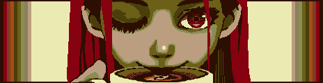
Don't drink this! Inky purples shift to blue, cyan, and towards yellow green as brightness increases, and saturation falls off in the highlight shades making this palette perfect for creating interesting glow and lighting effects. Using the brightest shades next to the darkest grants an intense amount of contrast for areas of focus while using the adjacent shades together grants a satisfyingly gradual transition, making this palette versatile in use for both smooth shading and vibrant pops of intensity.
- #toxicooze
- 8 colors
- 1,258 downloads
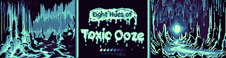
An image showcasing potential uses for the palette "Eight Hues of Toxic Ooze" - by
Digi
Tags: 3bit, 3bit, toxic, green, cyan, purple, teal, ooze, glow, neon, blue
Is this the "golden child" gameboy palette? Shades of two-bit color starting with an almost - navy blue that eases up to a mid green and finishes with classy gold and a warm white for highlight. There's plenty of contrast to go around, but these colors are still just analogous enough to draw you in without scaring you off.
- #goldenboygb
- 4 colors
- 562 downloads
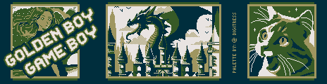
An image showcasing potential uses for the Golden Boy GB Palette, including an example (center) in original gameboy resolution. - by
Digi
Tags: gameboy, gb, two, bit, 2bit, green, blue, gold, beige, golden, analogous, rpg, yellow
Yowza, don't throw a fit - if you're looking for a palette, this is it! Blueish-purple shifts slightly warmer to teal, then skyrockets to bright pistachio and light gray so you can achieve high contrast without killing your eyes. All the while, the subtly desaturated hues maintain a harmonious feeling as you're transported back to the era of swishy pants, walkmans, and windbreakers.
- #twobithissyfit
- 4 colors
- 159 downloads
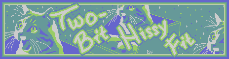
A drawing showcasing the palette "two bit hissy fit" - by
Digi
Tags: twobit, 2bit, green, purple, cyan, retro, complimentary, contrast, vaporwave, pop, cool, tint
Batten down the hatches, ye scurvy dogs and look closely, this isn't just a mono ramp! As brightness and saturation increases, the hue gradually shifts from cold blue to warmer cyan. Perfect for adding extra depth to your highlights and shadows with color relativity.
- #cyanstorms
- 8 colors
- 557 downloads
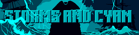
A palette example for the palette Storms and Cyan showcasing it's uses with water, shadows, and highlights - by
Digi
Tags: blue, cyan, dynamic, warm, cool, hueshift, storm, sea, ocean
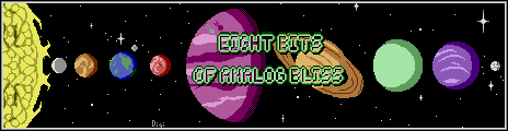
Variations of Luminescence based on colors produced by an original 1977 Television Interface Adaptor - found in the Atari Video Computer System
- #analogbliss
- 24 colors
- 264 downloads
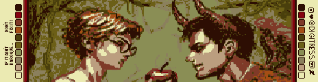
Swathed in warm tones, this palette is perfect for capturing dynamic lighting in the dreamy style of your favorite baroque frescoes. Gentle greens with warmer highlights and slightly cooler lowlights coupled with the pops of contrast can capture a garden so decadent that you'll feel transported to an Oscar Wilde novel.
- #baroquepalette
- 10 colors
- 1,020 downloads
some groovy contrasting warm tones with cooler darks for dramatic shading
- #bauhome
- 8 colors
- 1,190 downloads
There are no more palettes for your current selection.

Thanks for your feedback! If you want to say more, please post a Suggestion or Bug Report!
our next patreon goal: $283 / $500