The Lospec Palette List is a database of palettes for pixel art.
We include both palettes that originate from old hardware that could only display a few colors, as well as palettes created by pixel artists specifically for making art.
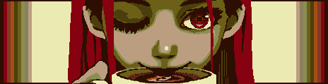
named after a root beer flavoured candy that soothes the throat. developed as two separate 2-bit palettes, "root beer float" and "tiger tail".a little difficult to get the hang of, but nevertheless rewarding!
- #horehound4
- 4 colors
- 2,357 downloads
Designed to create old-timey faded paper, as seen in wanted posters, old maps, etc. Contains one main ramp, and two alternative partial branches.
- #wanted21
- 21 colors
- 2,270 downloads

From the Lospec Wanted collab, posters by Razzak, BigPotato, Livestraes, gg & Jaman
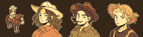
Three OCs I've created with the beautiful wild west vibes of this palette. - by
xxxx
Tags: paper, map, old, yellow, orange, sepia
Feel free to use this palette, works well for Western/old art
- #sepia6
- 6 colors
- 2,123 downloads
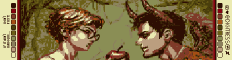
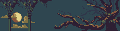
Swathed in warm tones, this palette is perfect for capturing dynamic lighting in the dreamy style of your favorite baroque frescoes. Gentle greens with warmer highlights and slightly cooler lowlights coupled with the pops of contrast can capture a garden so decadent that you'll feel transported to an Oscar Wilde novel.
- #baroquepalette
- 10 colors
- 1,121 downloads
Палитра в стиле «Старое кино» — это путешествие в прошлое, где оживают чёрно-белые фильмы и классические фотографии
- #oldmovie
- 6 colors
- 685 downloads
A warm, candle-lit palette restricted to 8 colours (no transparency). Meant for things like early NES graphics with a sepiatone feel.
- #jehkoba8
- 8 colors
- 765 downloads
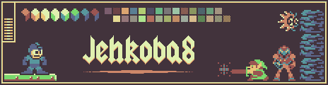
Example by
Jehkoba
Tags: jehkoba, jehkoba8, 8, sepia, brown, warm, clay, red, orange, yellow, green, blue, balanced, nes, retro, rainbow
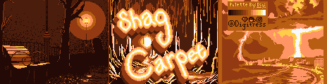
Eight warm hues ranging from deep, rich browns to orangey-pink, all the way to yellow with a pop of a surprisingly cool off white for extra contrast. Lose yourself in an ocean of shag carpet, wood paneling, and the groovy warm hues of the late 70s and 80s. Inspired by some original carpet in my mid century home, and altered to make a decent palette.
- #shagcarpetpalette
- 8 colors
- 663 downloads
Just a lil ditty I cooked up on a Thursday evening
- #sepiamoss
- 8 colors
- 585 downloads
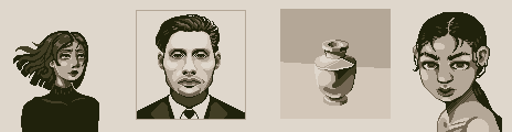
For images simulating old photos, in sepia tone.
- #interpretemesepiatone
- 5 colors
- 689 downloads
This palette was painstakingly designed with hand picked colors intended to recreate the chromatic aberration and other visual effects of a CRT monitor. 32 Colors, 12 Ramps which can each be used individually for monochromatic pieces or together for subtle variations and extra depth. Eight base colors with a sepia tone each have three additional variations in hue leaning to red, green, and blue, which gives the impression of the eight base colors being more neutral (although in reality they're each quite warm).
- #soggysepia
- 32 colors
- 326 downloads
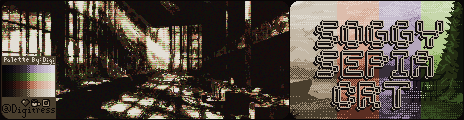
This example showcases some possible uses of the palette including the intended use of utilizing all colors to mimic the effects of a CRT monitor as shown in the first example as well as how it may look to use the Ramps as individual monochrome palettes as shown in the second example. - by
Digi
Tags: sepia, chromaticaberration, crt, vintage, retro, digi, soggy
There are no more palettes for your current selection.



Thanks for your feedback! If you want to say more, please post a Suggestion or Bug Report!
our next patreon goal: $263 / $500