A palette inspired by the colours in the music video for Omar Rodríguez-López's track 'Agua Dulce de Pulpo' from the album Un Escorpión Perfumado. It was originally intended for bold, colourful portraits with non-natural colouring.
- #escorpion
- 12 colors
- 150 downloads
I created this palette to evoke a spooky autumn and Halloween atmosphere in my entries for the Septembit 2026 pixel art challenge.
- #pumkyn4
- 4 colors
- 296 downloads
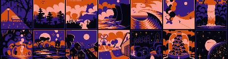
Example by
WQON
Tags: 4colors, 2bit, halloween, spooky, autumn, fall, cozy, vibrant, warm, orange, magical
A refined version of my "Z64" palette. I've spent more time on smooth ramping, swapped out a few colours to balance the spectrum, and done a bunch of tinkering with sprite creation to get this just right. A vibrant selection intended to cover all the needs of a retro game or art project. ♥
*** UPDATED — See "Jehkoba's Master Palette" for the latest iteration.
- #jehkoba64
- 64 colors
- 23,307 downloads

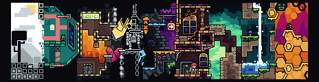
Example banner with ramps and sprites for the "Jehkoba64" palette.
- by
Jehkoba
Tags: 6bit, 64, 64colors, 64colours, jehkoba, retro, classic, snes, jrpg, rich, deep, vibrant, bright, cheerful, rainbow, lgbtq, lgbtqia, lgbtqia2s
Working from my Jehkoba64 palette and trimming down to half as many colours (including transparency), this 32-colour selection is perfect for emulating early SNES-style graphics, with vibrant tones and smooth ramping. Guaranteed to satisfy that retro itch. ♥
- #jehkoba32
- 32 colors
- 7,600 downloads
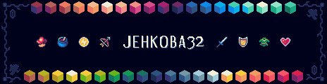
Example by
Jehkoba
Tags: 5bit, 32, 32color, 32colour, 32colors, 32colours, retro, classic, snes, jrpg, zelda, fantasy, ffiv, ff4, jehkoba, vibrant, rich, charming, rainbow
A palette with vibrant saturated colors that maintain a grounded and balanced style. With highlights ramping towards hot colors, and the shadows ramping towards cold you will have an immersive contrast that is pleasing to the eye.
- #hotcoldramps
- 92 colors
- 8,977 downloads

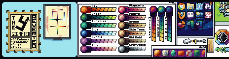
Palette examples. Note how the less saturated brown examples used for trees/sand can help boost colors around it. You can have similar desaturated cold lifeless metals, wood, etc to apply this affect in other cases. For best use avoid mixing the brown ramps as this is intended to be used for specific cases where you need more contrast. - by
Asarge
Tags: hot, highlights, cold, shadows, saturated, vibrant, color, ramps, asarge, andre, sargeant




Thanks for your feedback! If you want to say more, please post a Suggestion or Bug Report!
our next patreon goal: $263 / $500