The Lospec Palette List is a database of palettes for pixel art.
We include both palettes that originate from old hardware that could only display a few colors, as well as palettes created by pixel artists specifically for making art.
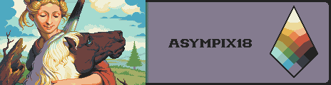
Palette for Pixeljoint's 18 colour palette competition. This palette takes into consideration human vision and is balanced on top of it, making it "human-centric" as I like to call it. The aim is to make as balanced and versatile a palette as possible within the given limitations; with the key balancing feature being the elimination and inclusion of certain colours based on their importance to the human mind. The distribution of the colours is skewed in such a way that the red-yellow range of the spectrum receives the most attention, followed by blue and green. The reasoning behind this is that this colour range in particular is the most important to our mind (most obviously because it accounts for all parts of the human skin). The palette's light and dark colours are distributed in such a way that there are more light colours than dark ones, with the reasoning being that we place more importance on the lights rather than on the shadows of an object or scene. In addition, the brightness and darkness of the black and white colours has been slightly neutered, to allow for a smoother transitions overall. Ultimately this should prove to be a balanced and flexible palette.
- #asympix18
- 18 colors
- 994 downloads
I wanted to attempt making a larger palette than what I usually create, and I honestly think I outdid myself with this one.
Hope you like it, cause I sure am proud of it! 
- #virbantskies48
- 48 colors
- 1,302 downloads
A warm, candle-lit palette restricted to 8 colours (no transparency). Meant for things like early NES graphics with a sepiatone feel.
- #jehkoba8
- 8 colors
- 767 downloads
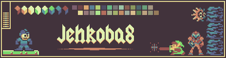
Example by
Jehkoba
Tags: jehkoba, jehkoba8, 8, sepia, brown, warm, clay, red, orange, yellow, green, blue, balanced, nes, retro, rainbow
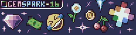
I'm quite proud of this palette, probably my best 16 colour palette so far.
Hope you like it!
- #gemspark16
- 16 colors
- 538 downloads
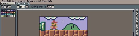
I've already experimented with making a palette that inverts into itself before, but my first attempt didn't go very well. But since then I've improved a lot and managed to make this fairly big palette! Hope you like it as much as I do!
- #inverse32
- 32 colors
- 322 downloads
A PICO-8 compatible palette designed to be easy on the eyes and leaning more into natural tones. Originally concieved as a replacement palette for LIKO-12, a now defunct open source PICO-8 clone.
- #rayleighpalette
- 16 colors
- 393 downloads
Tags: rayleigh, pico8, fantasyconsole, general, natural, balanced
Here is a well-balanced palette based on 4 high-sat base colors, 4 medium-sat base colors, and a blue-grey. Each has a light and dark shade, with some of them being extended further, to give a better range for earth/wood/gold/aqua materials. Based on the palette used for a JRPG engine I was making a long while ago... which was originally based on Fantasy 24 with some added purples, but for this, I recreated all the colors from scratch.
- #realmofesa
- 40 colors
- 388 downloads
There are no more palettes for your current selection.

Thanks for your feedback! If you want to say more, please post a Suggestion or Bug Report!
our next patreon goal: $263 / $500